
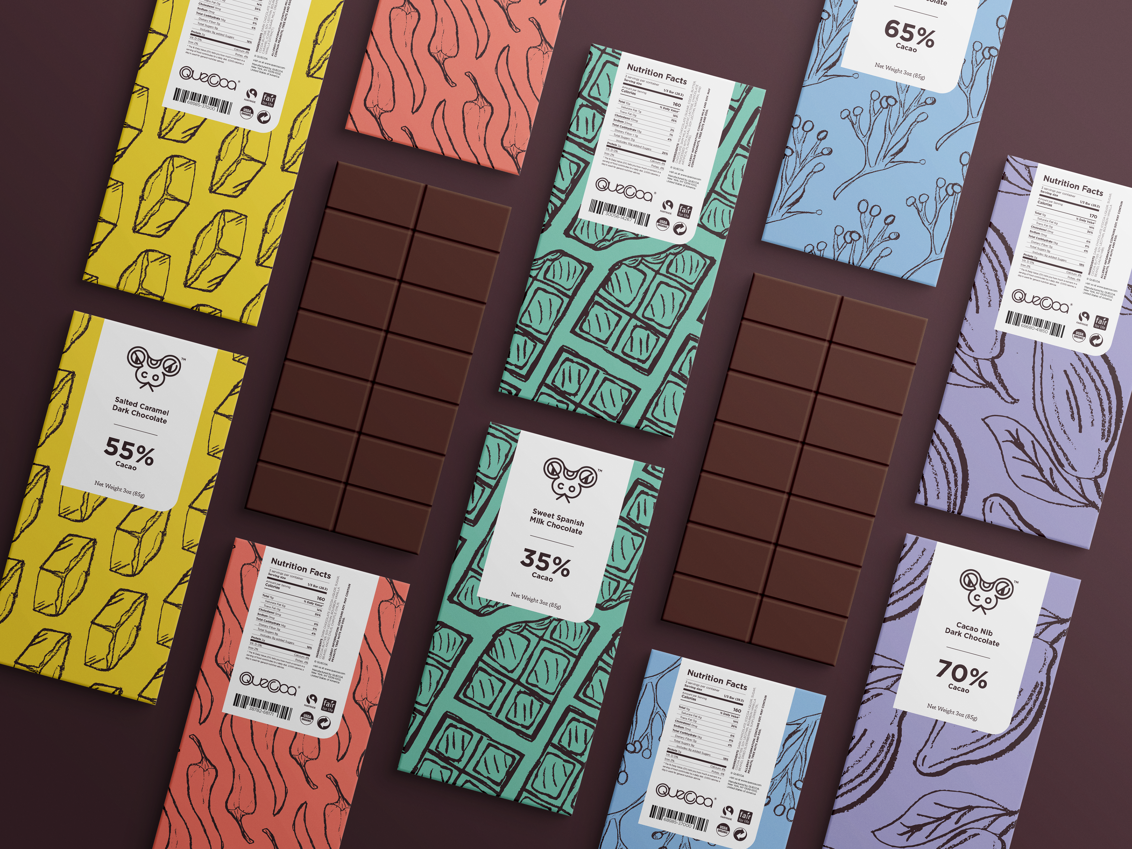
Promotional Posters
The goal for these posters was to convey the different flavors of chocolate. Quecoa incorporates hand drawings in many of its other components, so that hand-drawn quality was important to include in the posters' design.
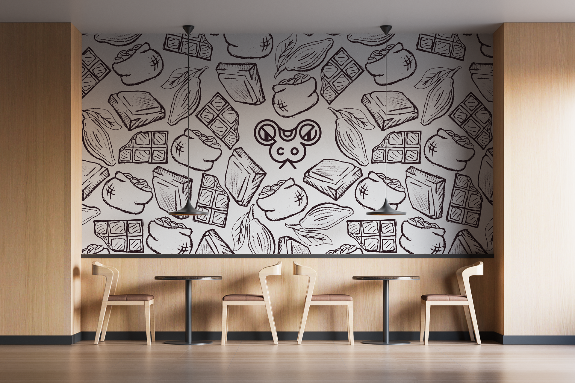
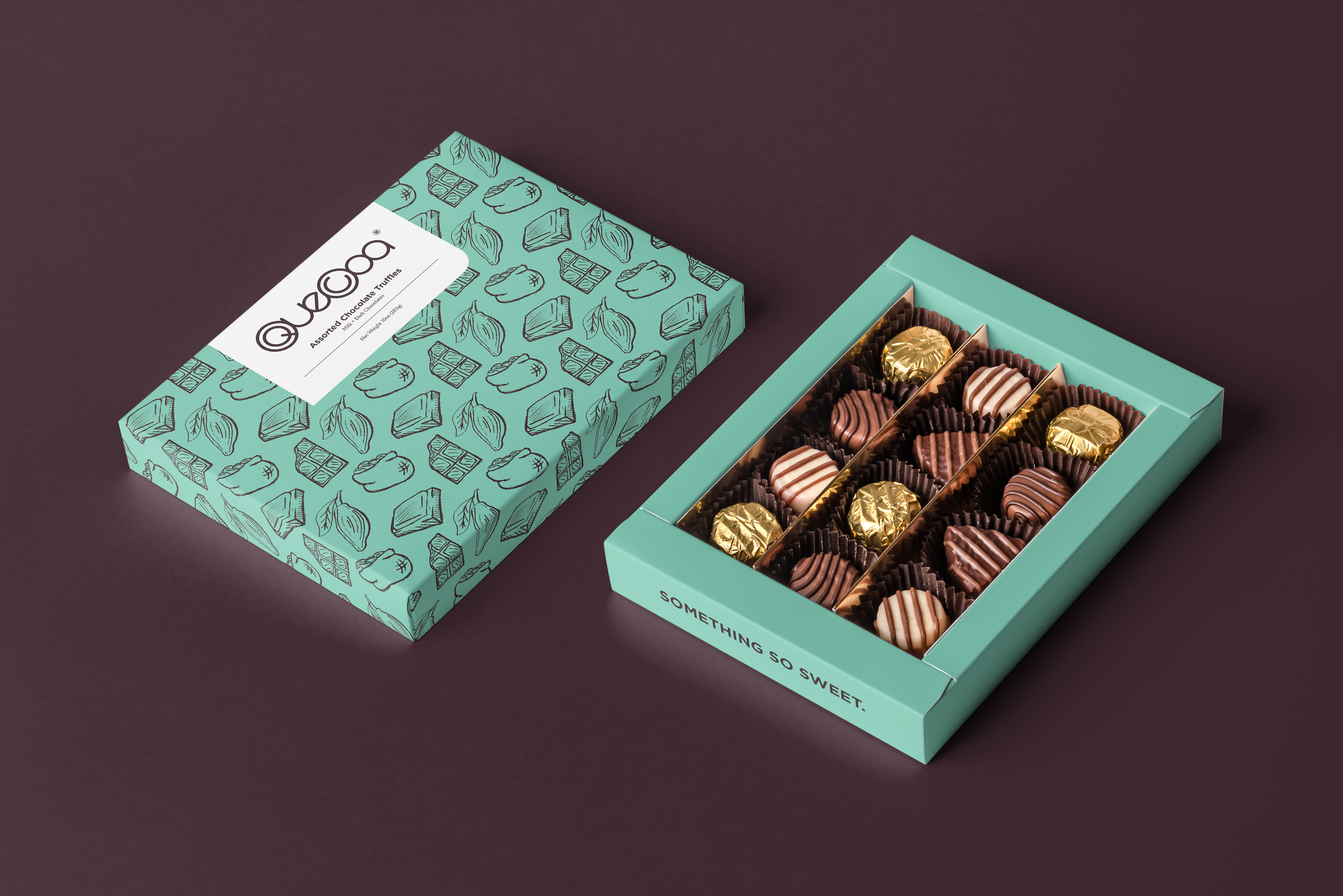
Packaging and Environmental Design
The packaging and environmental designs focus on incorporating the brand pattern. This pattern emphasizes the hand-made quality of the chocolate.
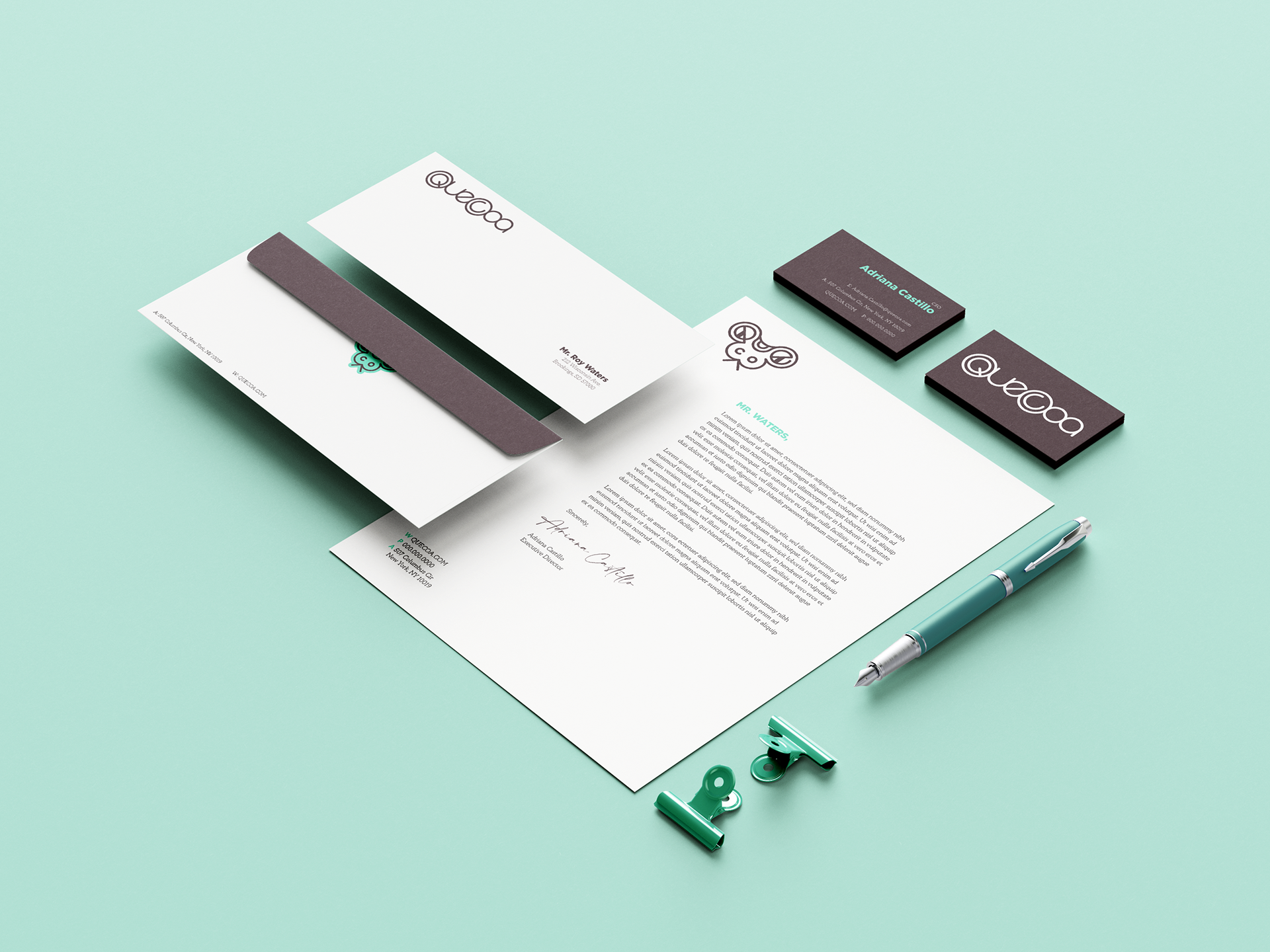
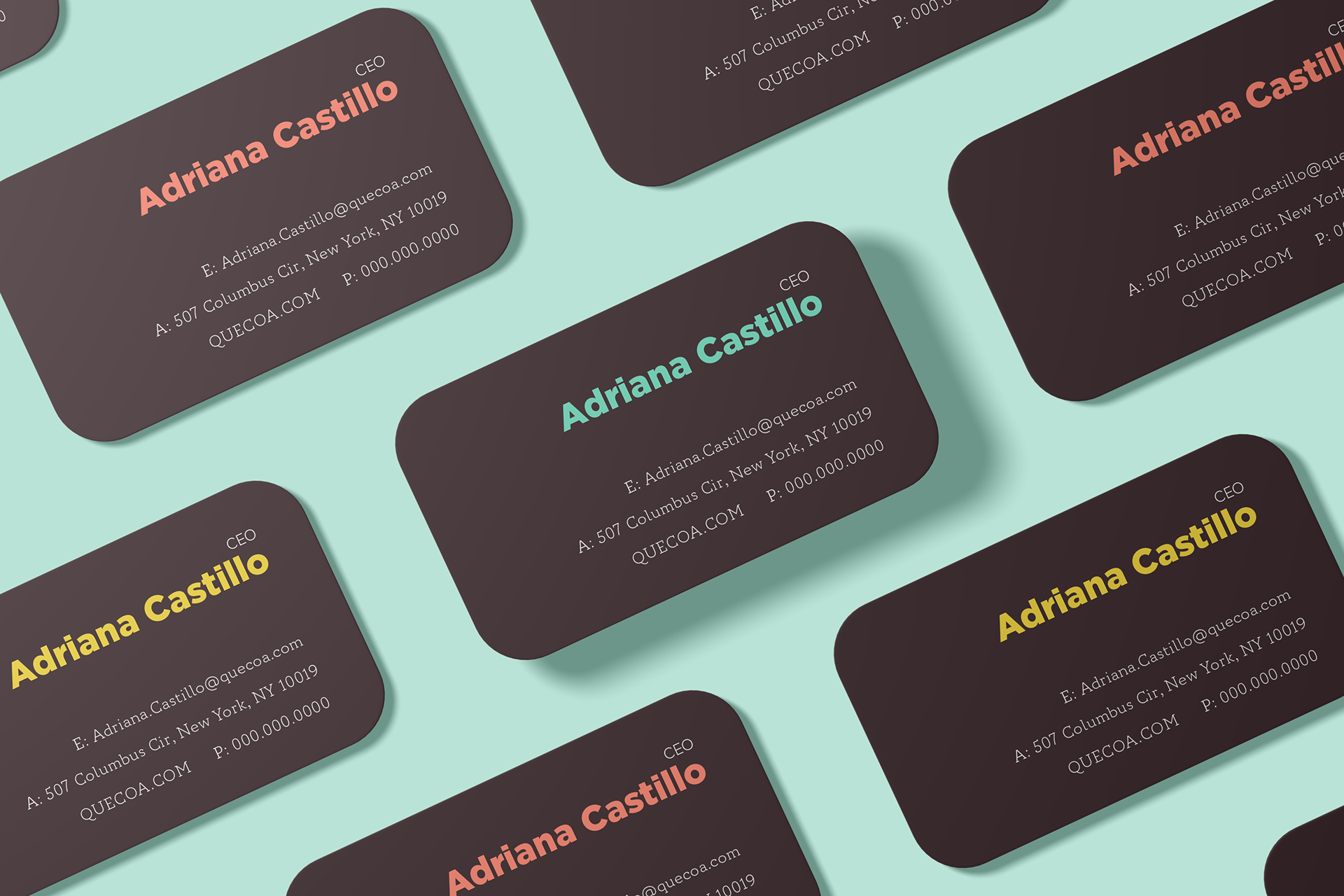
Stationery
The stationery emphasizes a clean, simple design to increase the legibility of the content.
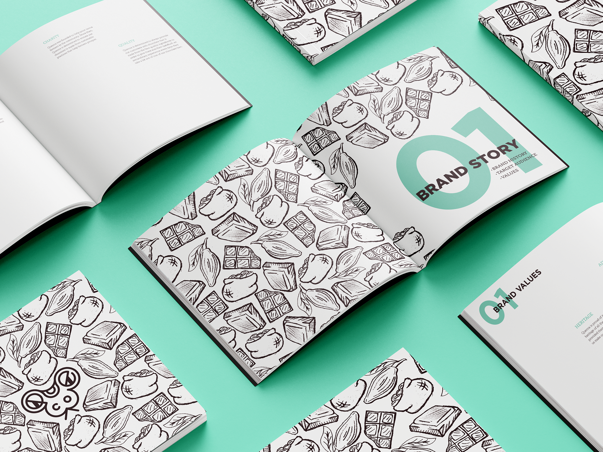
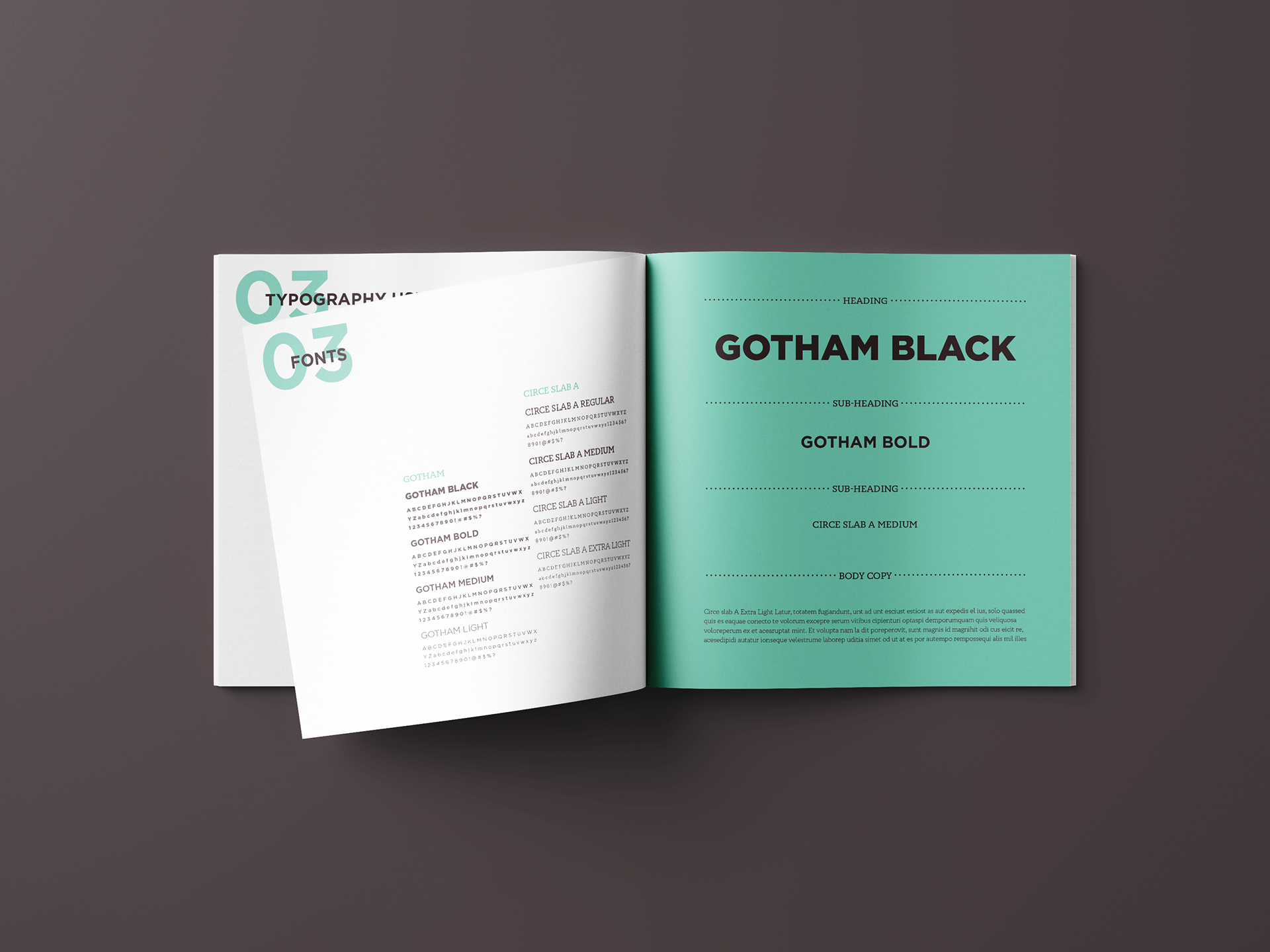
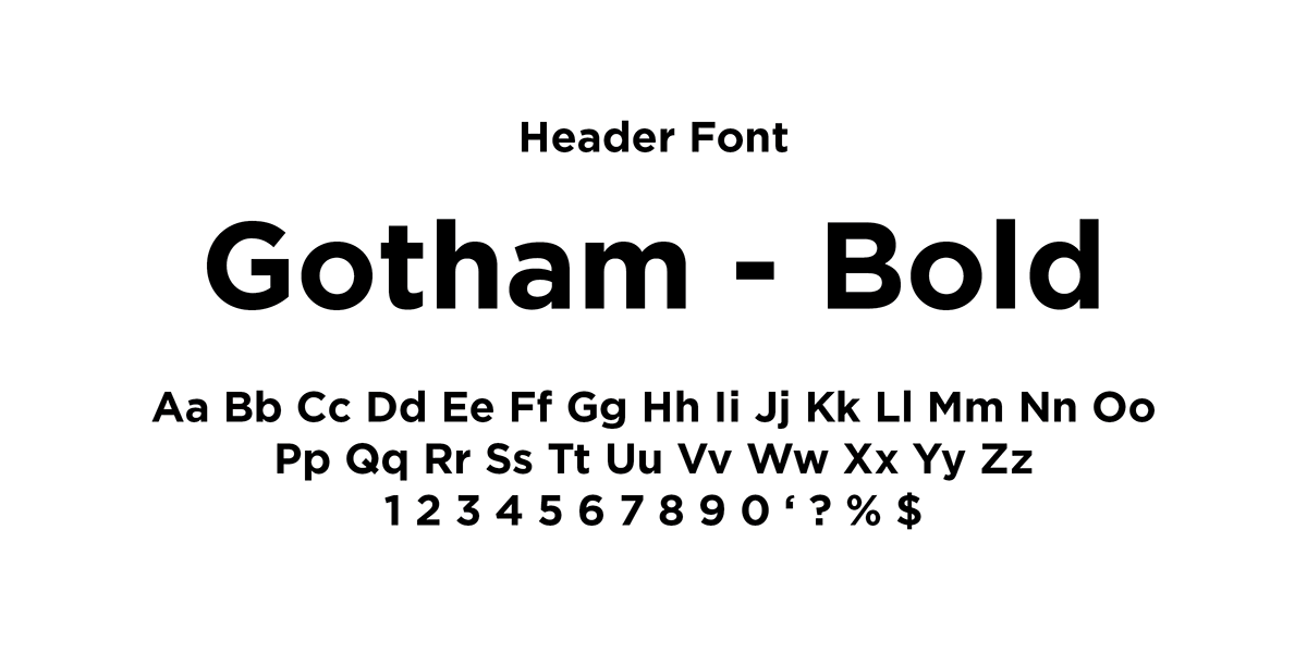
Brand Manual
The brand manual is formatted to emphasize a clean, simple design while also incorporating an organic layout.
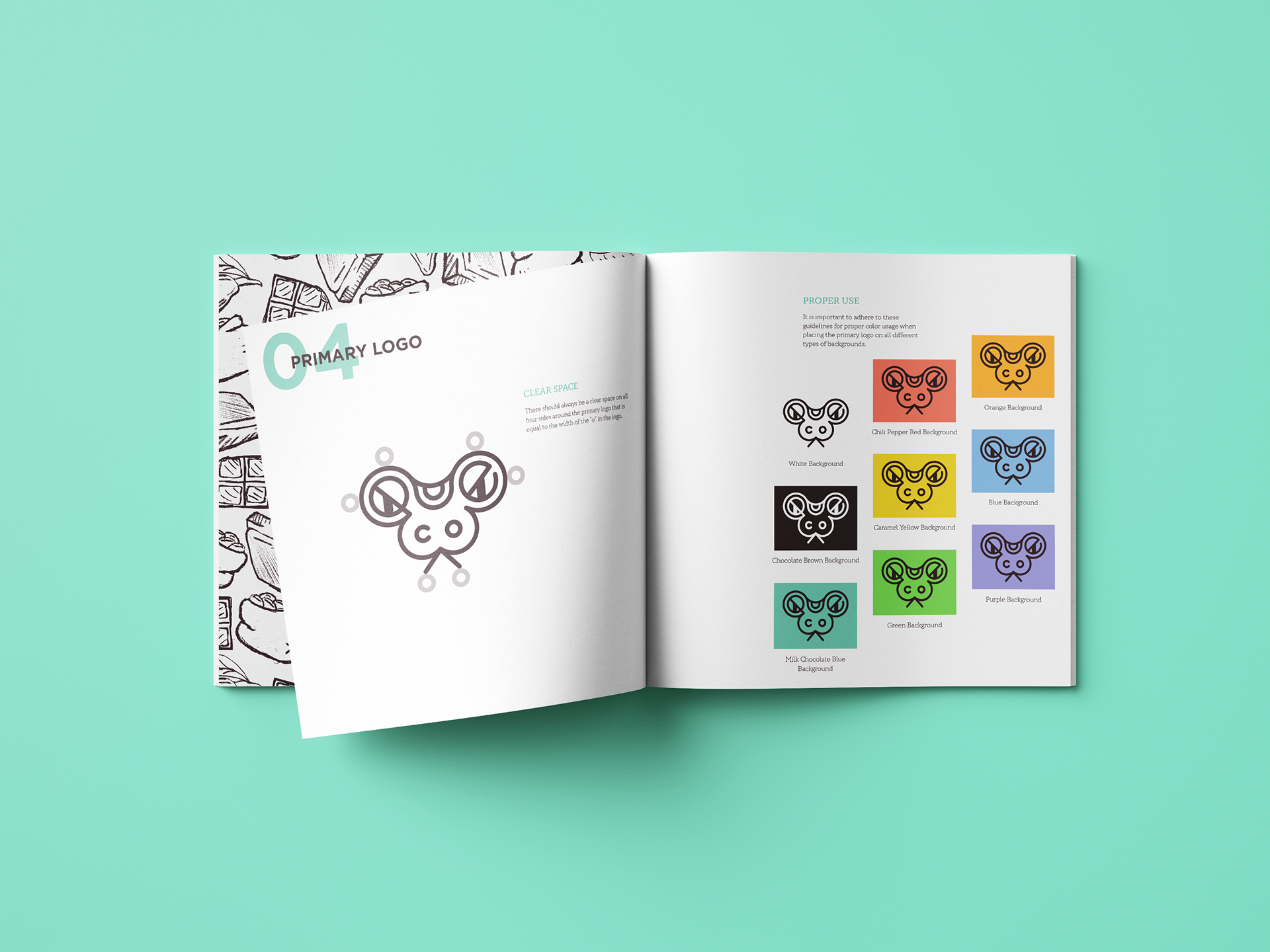

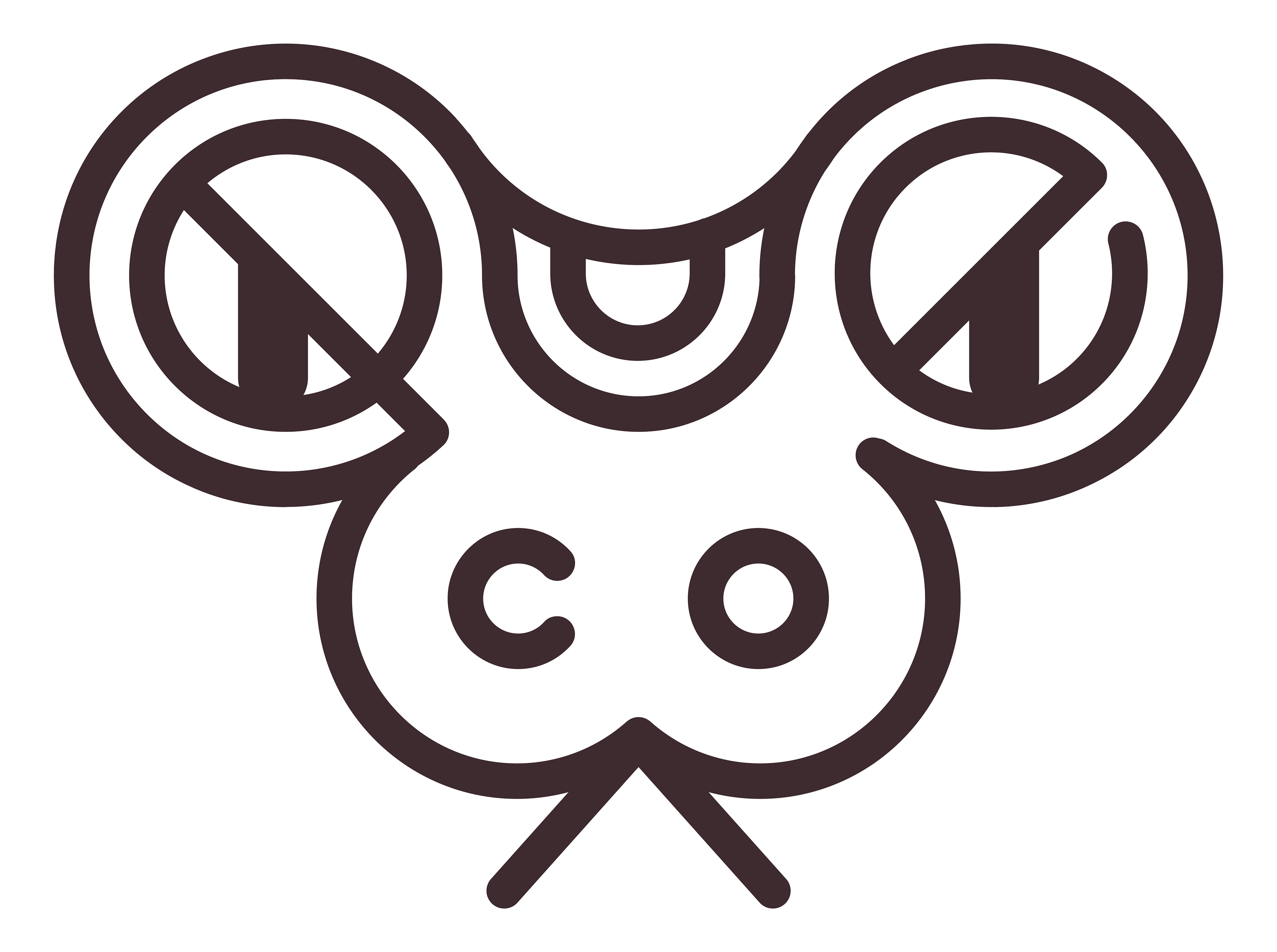
Main Logo and Wordmark
The primary logo was inspired by the serpentine god of chocolate in Aztec mythology, Quetzalcoatl. The wordmark was created to emphasize legibility.

Quecoa was a group project featuring the talents of Jack Derickson and Joshua Flatten. I am featuring my main contributions: promotional materials, primary pattern, stationery, environmental design and brand manual layout.